Graphic Design Submission #1
Lauryn B.
"Two Kinds of People"
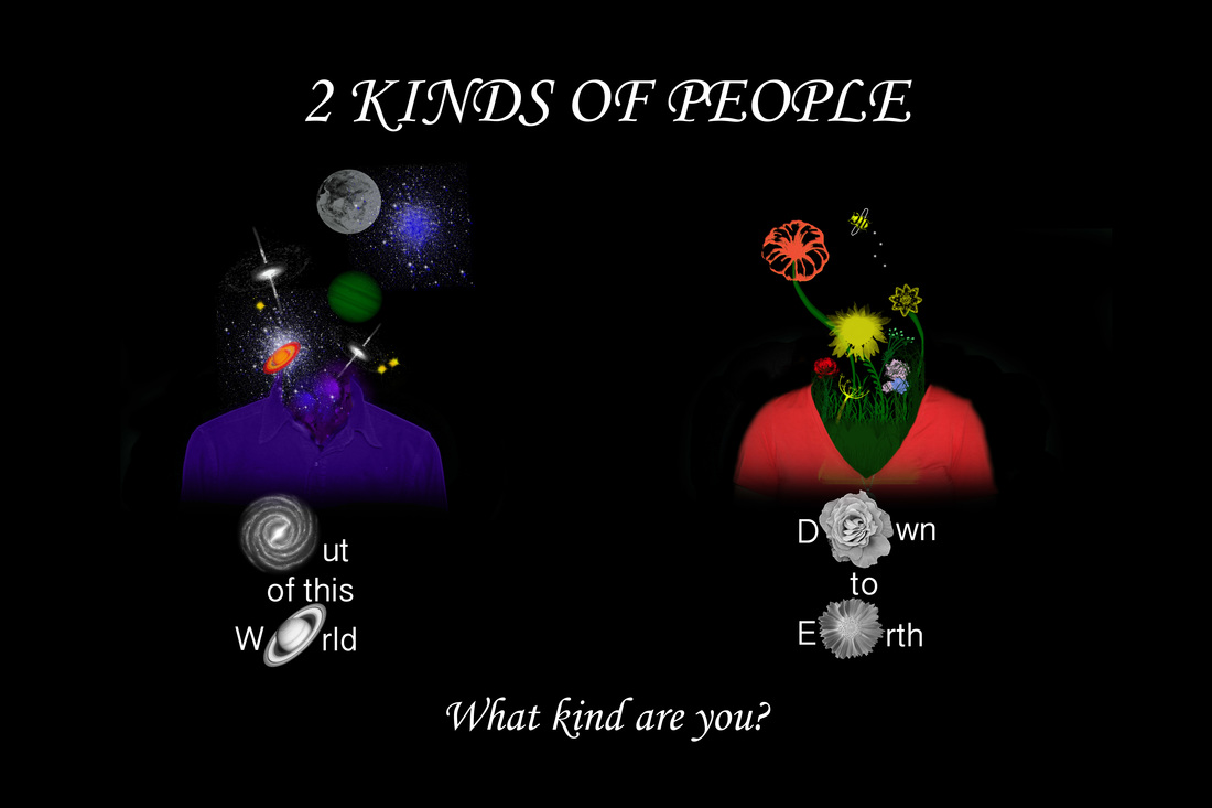
The meaning behind my image is giving a general look at people all around us. Some people are practical and realistic, while others are extraordinary and wonderful. Both characteristics are beautiful and that’s what I wanted my poster to capture. I chose to make this piece because I was very excited to see it come to life. It was once a pencil doodle on paper. I started by drawing individual sketches and importing them into Photoshop and fading around the images into the black background. I downloaded floral and grass brushes laying them on several individual layers under my first person to have the effect of the grass growing from her shoulders and chest. Then, I downloaded some stars, planets, and galaxy brushes and exploded them from the neck of my second person, also on individual underneath layers. The color of my models shirt corresponds with what is coming up out of them. The flowers match well with the peach v-neck, while the dark night sky matches the blue button up. My title “2 Kinds of People” interests an audience very easy. Following with a slogan asking the audience a question, making them stop and think about their own personal lives. The descriptions of the people contradict each other. Out of this world and in the universe is the polar opposite of being down to earth and grounded. I chose specific fonts that were simple but continued the elegance and excitement that I had for this piece.
Lauryn B.
"Two Kinds of People"
The meaning behind my image is giving a general look at people all around us. Some people are practical and realistic, while others are extraordinary and wonderful. Both characteristics are beautiful and that’s what I wanted my poster to capture. I chose to make this piece because I was very excited to see it come to life. It was once a pencil doodle on paper. I started by drawing individual sketches and importing them into Photoshop and fading around the images into the black background. I downloaded floral and grass brushes laying them on several individual layers under my first person to have the effect of the grass growing from her shoulders and chest. Then, I downloaded some stars, planets, and galaxy brushes and exploded them from the neck of my second person, also on individual underneath layers. The color of my models shirt corresponds with what is coming up out of them. The flowers match well with the peach v-neck, while the dark night sky matches the blue button up. My title “2 Kinds of People” interests an audience very easy. Following with a slogan asking the audience a question, making them stop and think about their own personal lives. The descriptions of the people contradict each other. Out of this world and in the universe is the polar opposite of being down to earth and grounded. I chose specific fonts that were simple but continued the elegance and excitement that I had for this piece.
Graphic Design Submission #2
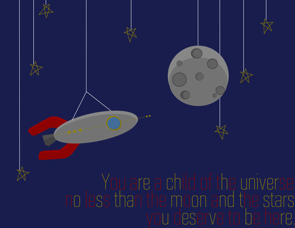
Lauren M.
"Child of the Universe"
I made this image using Adobe Photoshop. The whole thing was made using only shape tools, paint bucket tool, and the text tool. It was made from a blank canvas. Each shade and shape represents a different layer. Everything from the moon, rocket, and stars, was made from shape tools. I used slightly different sized and shaded shapes to give the piece a little depth (to create shadows on the objects) , while still making it look like a cartoon. I placed all of the shapes very strategically to make it aesthetically pleasing. The last step was to add the text. After searching for hours through copyright free fonts, I finally found this one, which I liked for it's futuristic look. To spice it up a little, I selected various pieces of the words and varied them in color. This piece is displaying the idea that everything, and everyone was put on the earth for a reason. All important, so shoot for the STARS and great things will happen. I also made sure my piece had a cohesive color scheme.